“Suppose I were to begin by saying that I had fallen in love with a color.”
― MAGGIE NELSON, BLUETS
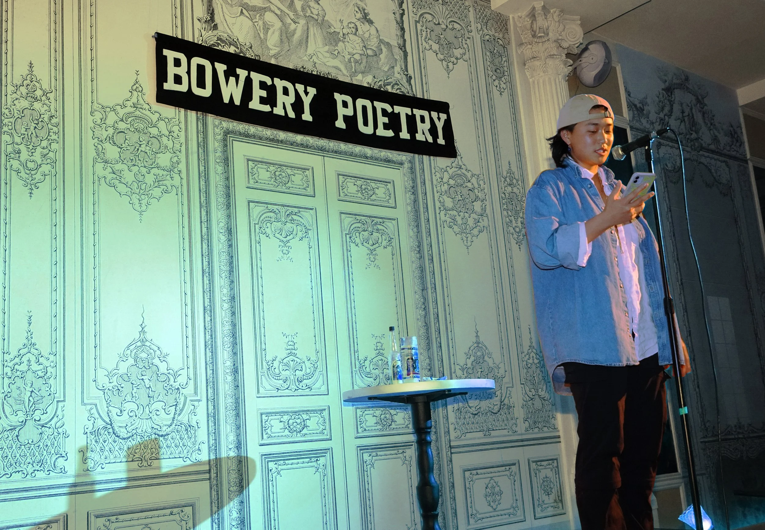
Endless Blue Poetry Salon is a monthly reading series at the Bowery Poetry Club. This salon showcases prominent and emerging writers in New York, exploring themes of culture, queerness, trans identity, astrology, and the color blue.
I was tasked with creating a cohesive theme design which would unite the works of several poets under one visual identity. The main goal at hand was to compile an impactful visual package, since many other events, poetry and otherwise, are vying for audience attention in the city.
For this project, I brought logotype design, branding, digital assets, and social touchpoints to life, as well as the photos and videography for social.
PROJECT
Endless Blue Poetry Salon
TEAM
Bob Holman, E.R. Pulgar,
A.G., Atika Chadha, Ashley Oddi,
Sophie Marsh, Jacob Seferian
ROLES
designer
photographer
videographer
One of the consistent elements in this design package had to of course be the color blue. I conceptualized a primary logo which would reside in posters, stickers, and other print materials, as well as a secondary web logo which consolidates the title in large groups of text, all in variations of blue.
After showing various iterations of the primary logo to the host, we decided that staggering ‘Endless Blue’ into ‘End Less Blue’ would create a tongue-in-cheek saying and higher emphasis on the ever expanse of blue.
My decision to use a varied weight, curved sans serif typeface for the print material logo was inspired by ocean waves—I envisioned the ebb and flow of waves, visualizing the contrast of water crashing and remaining still paralleled in type weight.
As for the secondary typeface, I thought about type integration on 2D screens. The jitter effect with Loveglitch typeface echoes 8 bit style and the RGB channels on a screen, which work well as a texture on social and also highlight the return of Y2K aesthetics.
This is the sponsor logo stylesheet I compiled and adjusted to ensure each of our sponsors was represented according to their sponsorship rules & needs.
I created these astrological icons in Photoshop, wanting to keep a 3D beveled texture and metallic nature pulled from the Gen Z resurgence and affinity to rave culture. This visual appeals to the intended target audience, and welcomes the new astrological season with a mystical night of painting worlds with spoken word.
The monthly nature of the series makes it so each poetry reading falls under a different astrological season. As the sun moves into a new astrological constellation each month, I mark the following reading announcement with the corresponding icon of that season.
In addition to a primary hierarchical color palette, I expanded color variations and palettes for each volume of the series in order to highlight the expanse of blue.
As each monthly flyer tended to include similar information apart from the readers announced, the color became one of the differentiating elements for each volume while still keeping the design and brand cohesive.
I formed each color palette on the astrological characteristics of the season. This meant going with a dark, moody, indigo palette in late November, reflecting the qualities of Scorpio season (fixed, focused, water sign) and light and airy during June, Gemini’s season (fluid, mutable, air sign).


